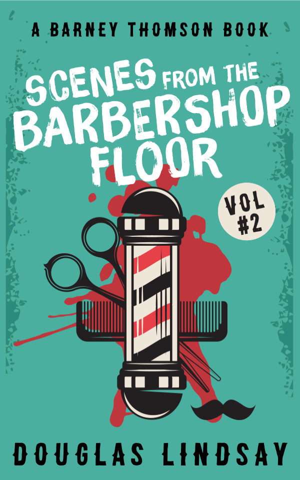
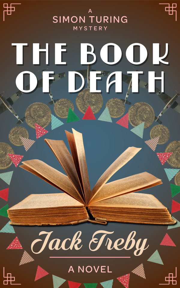
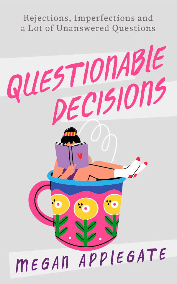
|
What a Good Cover Should Do
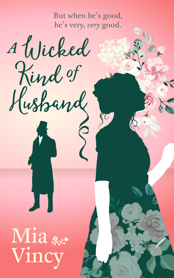
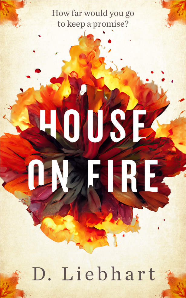
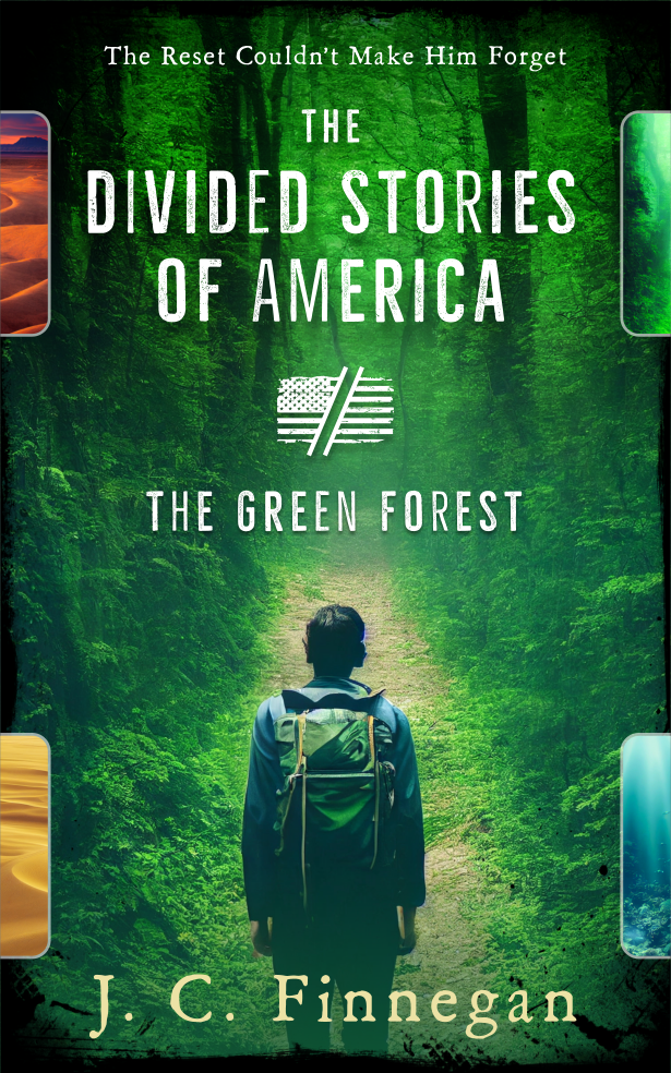
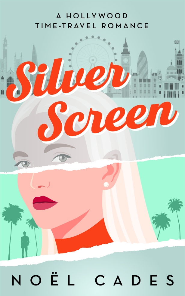
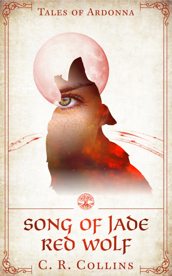
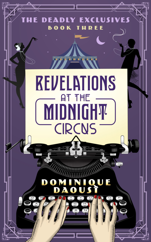
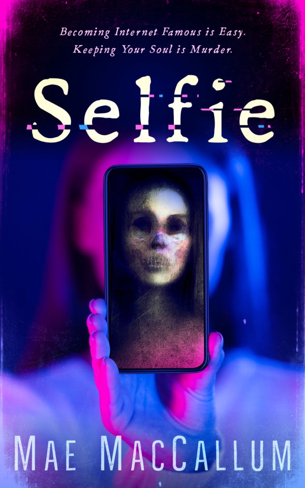
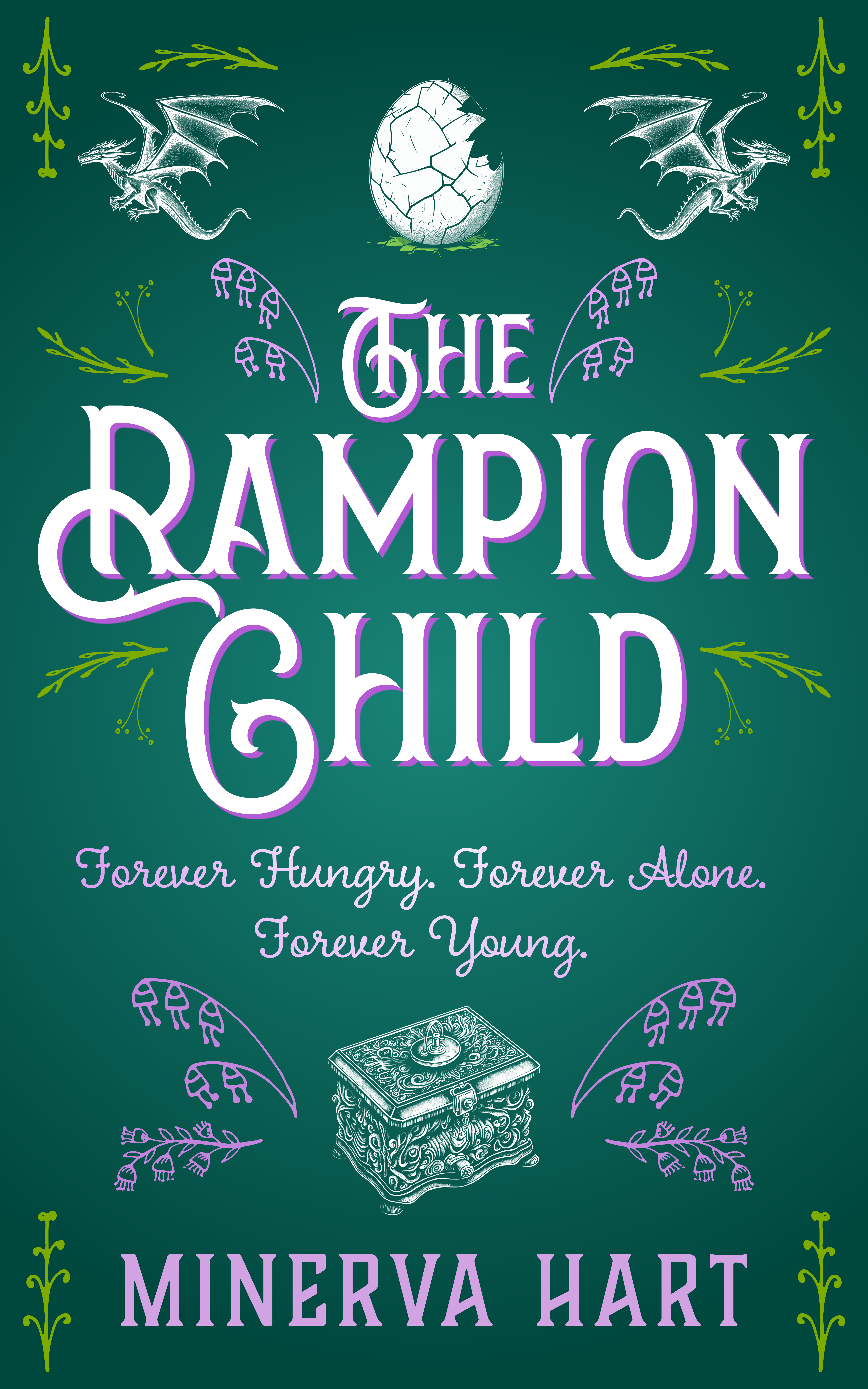
You might have a good idea of what makes a good book cover but I think it’s fair to share all my prerequisites because you might have missed some of the more obvious ones. Book covers are not just there to look pretty, they should also fulfil certain criteria. These are the functions of a well-designed book cover:

|
Catch a Potential Readers Eye
Now that every man, woman and their dog — and even me — can publish a book on Amazon Kindle you’re up against a vast swathe of competition. I always think it’s best to try and stand out against everyone else. So a cover should always have something about it that makes it just that little different to everyone else’s offering. If your book cover does just one thing, and one thing alone, it should do this!
|

|
Tell a Story
It seems obvious but a book cover should start to create a spark of imagination in potential readers’ eyes as to what the story is all about.
|

|
Set a Mood, Feeling or Tone
A good book cover will always get the feeling of the story across quickly so potential readers know what journey they’re in for. It’s why nonfiction books are usually very clean and simple: they’re saying the information inside the book is clean and simple. Or why a suspense novel is presented in a blurry off-kilter way: this story will be hazy and odd.
|

|
Intrigue a Reader
There are many ways to get a potential reader to think: I want to know more about this book, I want to dig deeper. All covers should do this basic thing without confusing readers or feeling too bland it’s not worth investigating.
|

|
Show a Single Simple Strong Concept
You only have so much time and space to grab a reader’s attention: generally split second on an Amazon search result tiny thumbnail. An overly elaborate and complex concept might work on a giant painting in a gallery where the viewer has time to paw over all the detail. But with a book cover we need to get across the information quickly and powerfully. Think more great album cover, rather than movie still!
|

|
Establish a Brand (Sometimes)
If you’re planning on writing more than one book, even if it’s not a series, establishing your visual brand as an author is important. It locks potential readers into who you are and your voice as an author. It’s something they will buy into and will lead to them a loyalty and feel all authors should do this. So I try to build in some sort of strong branding into any cover design I do.
|
So as long as a book cover does all of these things then you’re onto a winner and it’s how I approach any project.
What Doesn’t Makes a Good Cover
It’s only fair to say that down the years I’ve had my fair share of authors that have asked for certain things on cover that really, to my mind, don’t work. And here are some common mistakes that authors make, which I would say are best avoided:

|
Too Much Complexity
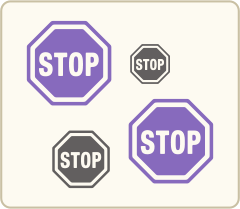
To try to sell the story, authors sometimes keep adding more and more visual elements to a cover hoping that one more thing on there will make it just right. The problem with this thinking is that the more visually complex a cover is, especially at smaller size on an Amazon thumbnail or a mobile phone, the harder it is to see what’s actually going on.
|
|
Too Much Text on a Cover
Likewise, trying to spam cover with text will have the effect of making a potential reader less likely to read what’s on there, not more. A cover is a visually medium. It should be the picture telling a thousand words, not the words. Three or four text elements is the ideal per cover, I would say.
|

|
Wanting to Follow the Tropes of the Genre Too Closely
I don’t have a problem with using ideas that are the usual suspects on covers: couples on romance covers, spooky houses on horror books, etc. but I always think it’s a good idea to somewhat subvert the clichés. If everyone’s horror book is black, why not go with white, or even teal, or even pink to make your cover stand out against all the other offerings. You don’t want to turn up at the ball in the same dress as everyone else? You don’t have to reinvent the wheel but you can add some interesting hubcaps.
|

|
Just a People or Place
There is nothing wrong with people or places on covers but I think if they don’t tell something about the story then it’s just saying your book happens somewhere and is about someone. And 99% of all fiction happens somewhere to someone. So it needs to say more. And on the point of people on covers: I’m not a massive fan of faces that can be easily made out, it somewhat spoils the effect of imagination in a reader’s head. It’s surely better for a reader to paint themselves into the protagonist’s shoes. But that’s just my opinion.
|

|
Being to Wedded to the Image in Your Mind’s Eye
There are a few reasons why I try to get an author to let go of the book cover image they might have in their head.
Firstly, and probably most importantly: it turns design into a goose chase. Most of the time we will not be able to find the exact, correct, source material to work from (i.e. a stock image which is the same as the image you have in your head). In fact it never happens.
Secondly, some of the time authors think in terms of characters and scenes and this doesn’t always get across the best concept for a cover, it doesn’t fulfil the functions I laid out earlier. I can definitely come up with a stronger concept. But we can have a chat before you commit to commissioning me and decide the direction to go. I’m always up for a chat.
|
So any of these mistakes can immediately sink a good concept and your potentially-amazing book cover. But we’ll work together to get a cover that’s right for the book you’ve slaved over. I’m here to help.
How I Like to Work
Having said all that, it sounds rather daunting to try and hit all those requirements and miss all the mistakes. But don’t worry. That’s what I’m here for. That’s my job and I’ve been doing it for years, so you’re in experienced and safe hands.
When I approach any project I like to see it as a collaboration between myself and the author, chatting via email, until we hit upon the right concept, the right ideas we can take into the design phase. So I really like to have a good chat with an author before you book in the work. To see where we can take something.
So before you book in, let’s chat!
You can email me at humblenations@gmail.com and my name is James!

What I Need for Us to Start Chatting
For any project I like to get in touch and give me an outline of their book, the best way to do this is to give me ALL the following information, to get the ball rolling (try not to miss any of these answers):
- The title, author name, taglines or any other text you want on there. So I have that at hand if we go ahead.
- Do you have an image in mind for your cover? A. Yes, I have a set vision. B. No, I want to leave it up to you, entirely. C. I want you to tell me what you think of my idea.
- A list of the three strongest elements that you book is about, each as a single sentence. The three things that pop to mind first when you think when you think of your story.
- A list of the three most important plot points, each as a single sentence.
- If you could sum your story in three physical things, tell me what they would be?
- Three or four sentences about the story. I’m more interested in the premise rather than the plotline (if you don't know what a 'premise' is I suggest you find out, because it differs from 'plot').
- One sentence to get me excited about your book.
- The mood & tone of your book.
- The genre of your book.
- Your ideas for your book cover. What you want to see. But bear in mind that your ideas might not make a good book cover. But at least we can have a chat. And if you answered 'A' to the first question then I need an much detail as possible about your vision because unfortunately I'm not a mind reader. It's your vision, so please go into all the important detail for me.
- By all means attach any screenshots or links to other book covers you like, with information about why you like them, so we know what sort of direction we want to go in.
- And finally, if you want me to use ShutterStock Stock Images for the cover, or if you want me to generate images using MidJourney, the AI tool I use these days. If we're going down the AI route. Most authors go down MidJoruney route when they realise how limiting stock images are.
PLEASE: Do not be lazy and copy and paste me your opaque marketing material. I get this far too often. You need to remember that I’m going to potentially design you your book cover, you’re not trying to sell me your book. So I need full clean, clear, explicit answers. You’re not spoiling the ending but telling me everything in cold detail. It’s what I need! It’s vital!
PLEASE: Take your time, and make sure you answer all these questions, clearly. I’m not a mind reader and I find these questions are the best way to start a discussion. It sounds harsh but there is work you need to put into this process.
Order Some Work
Once we decide on a good direction for the design, after our little chat it’s time to book the work into my schedule. Use the buttons below:
|
|
|
Some of my recent work...


|
|


